Order and activate
Project overview
Dialog has been selling connectivity products online for a long time, but those sales are more manual than they appear. A customer enters their basic information and requests a connection online. An agent then verifies their details and ships the product to them with a delivery agent, who gathers all the critical information, such as their identification number, and sends it back so the product can be activated. This whole process normally means the customer waits several hours to days before they can actually use the product, even after delivery.
The purpose of this project was to automate the entire process by letting customers enter all the information required for activation when placing the order online, so that by the time the product is delivered, it's activated and ready to use.
The approach
Since this was a new concept for the Sri Lankan market, our approach was to launch an MVP alongside the existing order placement to check the conversion rate, then gradually add the document capture processes, and eventually enable it for all connectivity products on Dialog.lk.
Competitive analysis
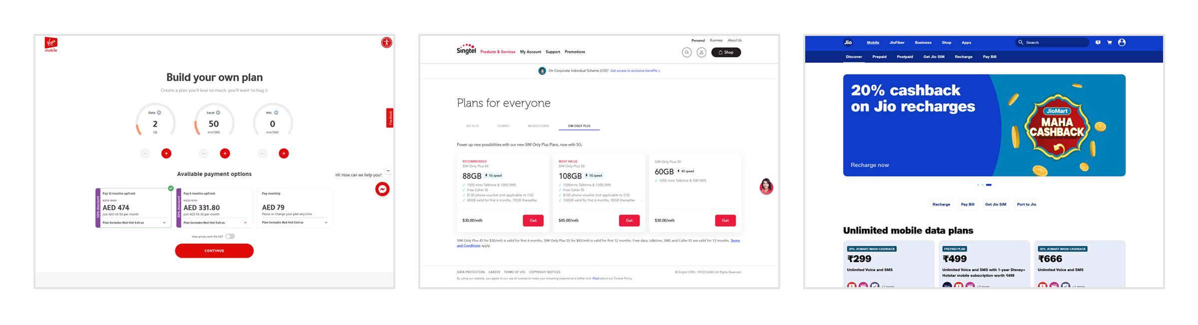
Since the concept was new to Sri Lanka and Dialog was pioneering digital activation, there were no local competitors to look at. So we turned to international telecommunications companies such as Singtel, Jio and Virgin Mobile UAE.
User flow
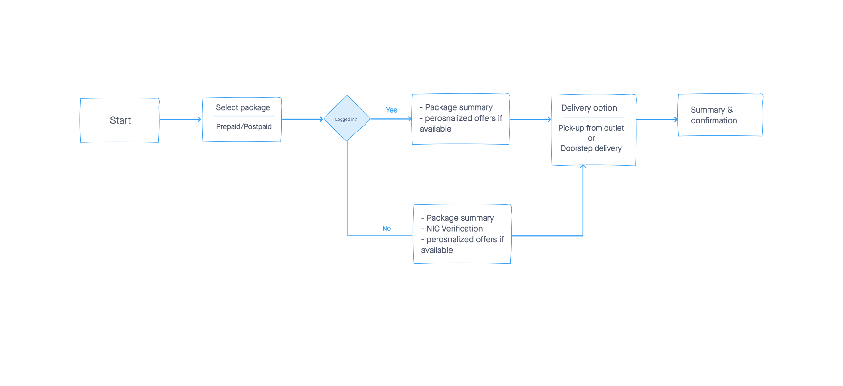
Based on the competitive analysis and business requirements, we designed a simple user flow for one of our products. The flow let users enter all the necessary information while purchasing the product, limited to one product at a time.
Design
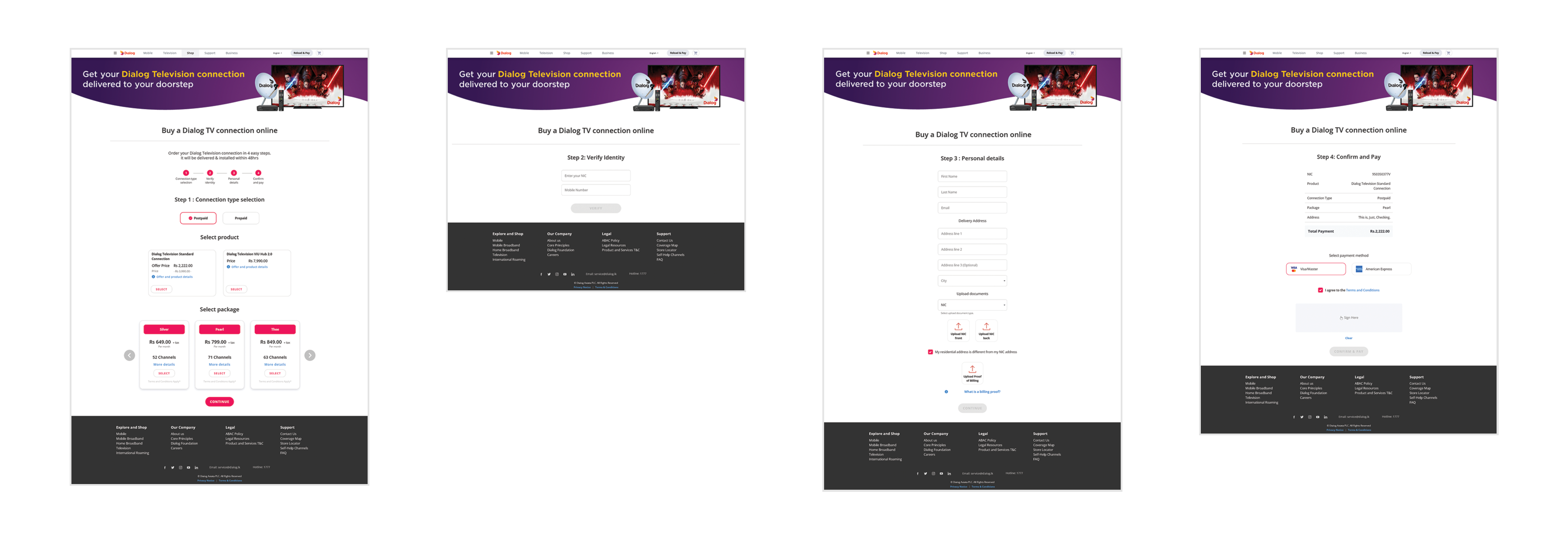
We took a minimalistic approach to the design, with only the relevant information visible on screen. Our aim was to reduce the number of pages the customer had to go through, making the journey feel a lot shorter and simpler.
Validate
Once the design was live, we used analytics tools such as Google Analytics to measure bounce rates and user interactions.
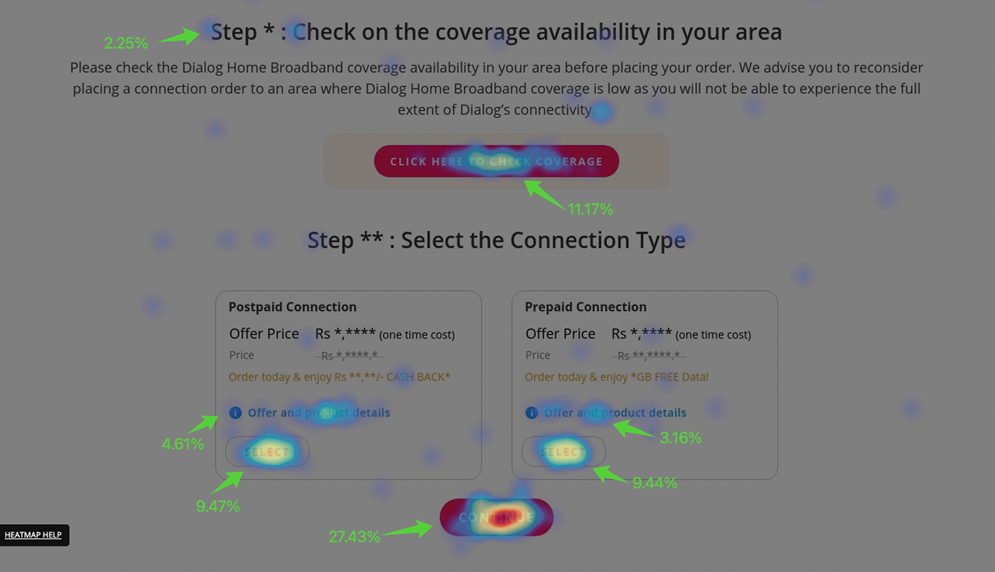
We also used heatmaps to observe how users engaged with the design and where engagement increased or decreased. We identified a few places with false affordance, which gave us an idea of users' expectations in the journey.
Rethinking the flow
Once the MVP was up, we used all the statistics we obtained to see how users were moving through the flow. We discovered specific steps that users had difficulty completing; especially when a page was long with a lot of fields to fill, the drop-off rate increased. Therefore, we decided to go with one step at a time.
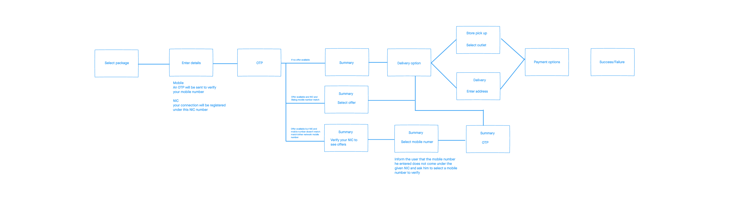
In addition, we needed to build the entire verification process into the flow, allowing the business to activate services upon delivery. This was more complex than it sounded, since each product had different verification requirements and restrictions.
Wireframing
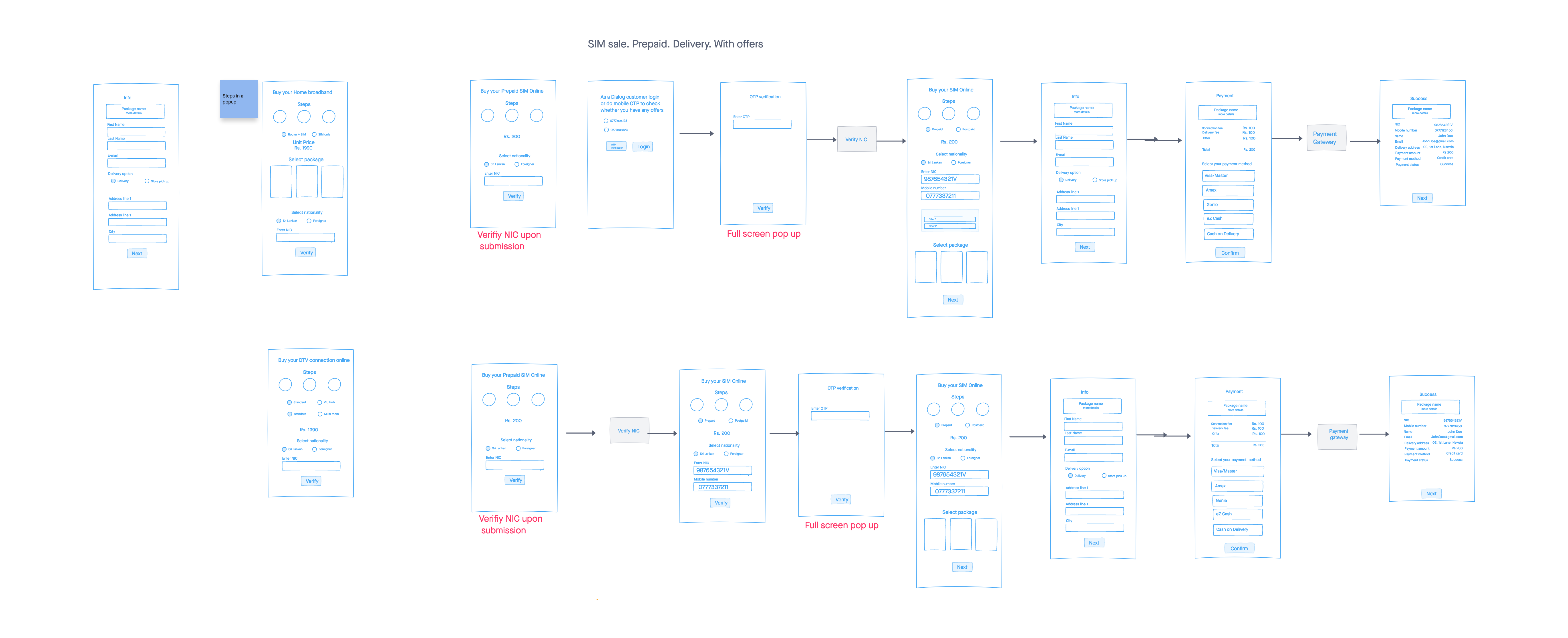
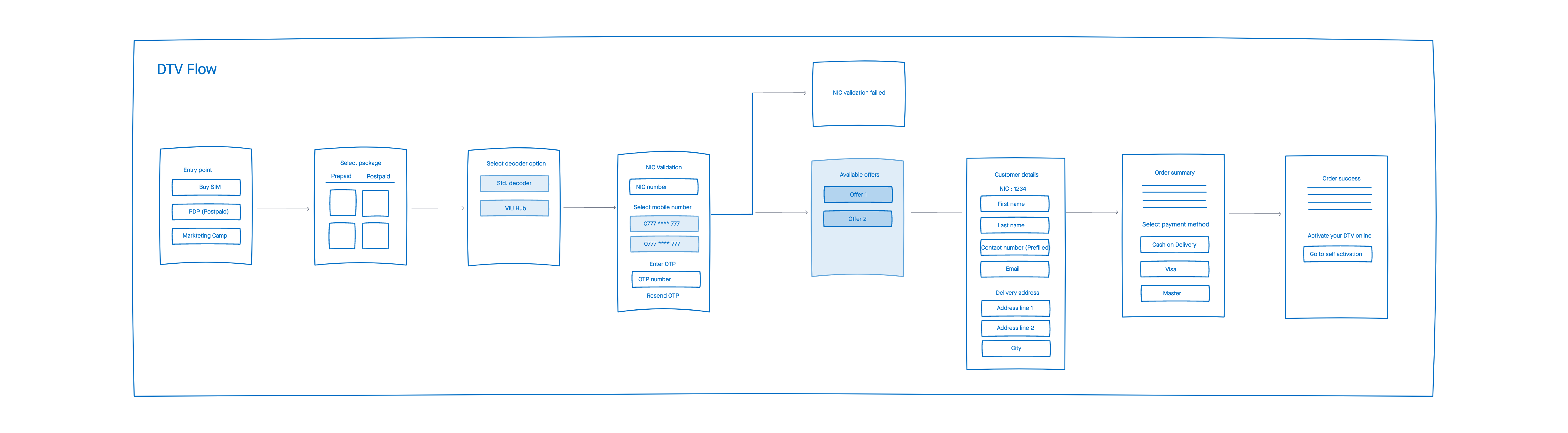
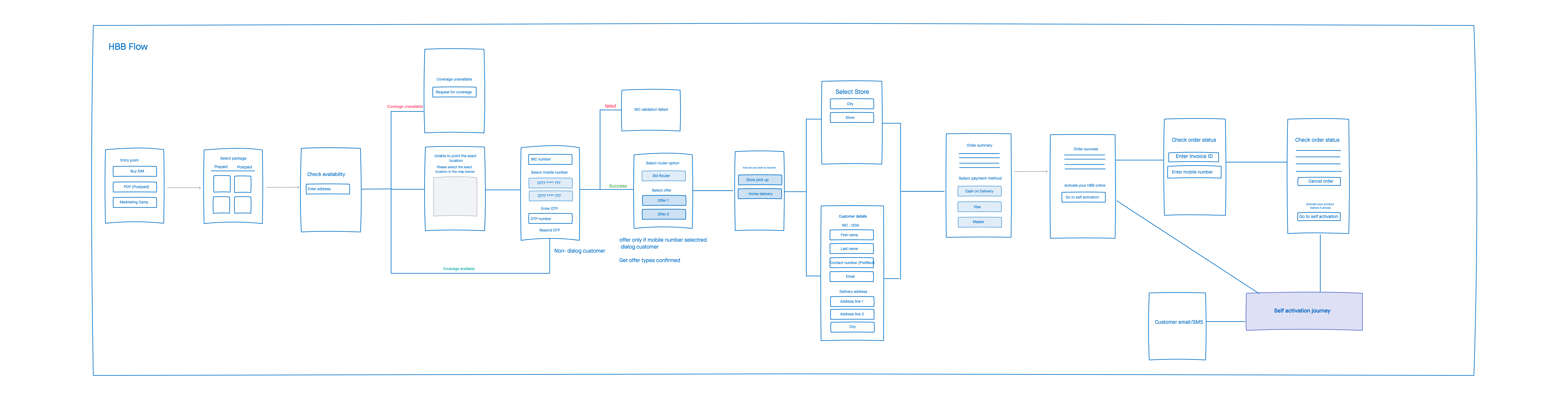
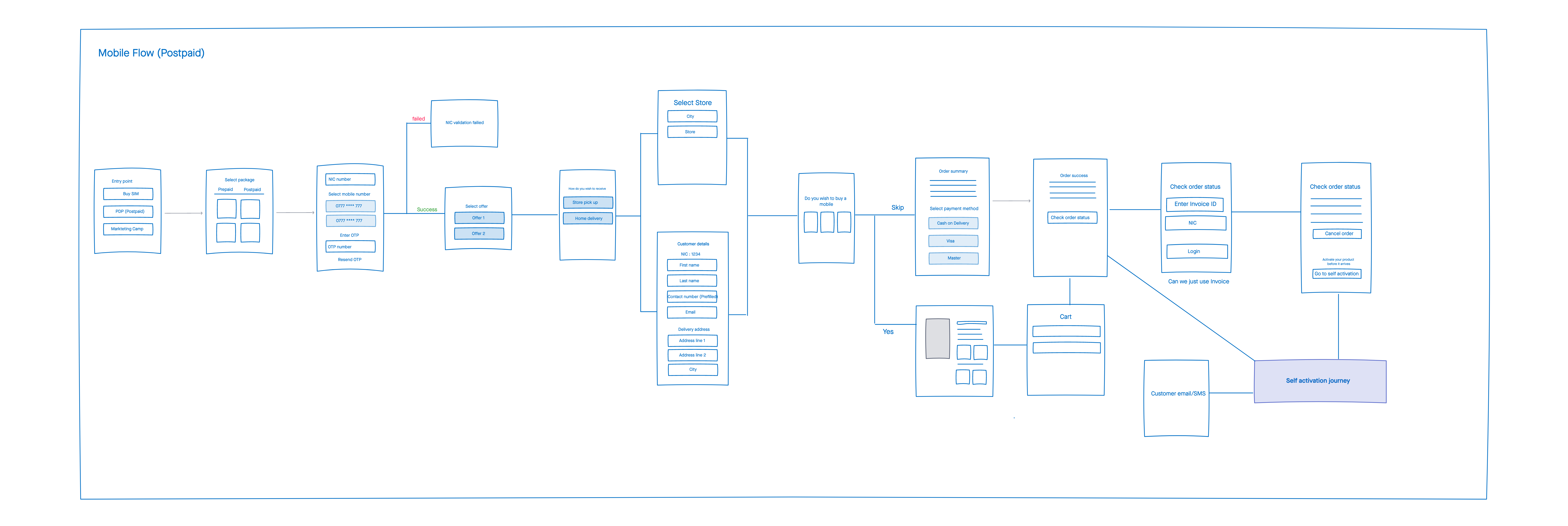
With more processes in place, the flow became more complex, and we needed a consistent flow that worked for all connectivity products as well as the e-commerce part of the website, which was to be implemented in a later phase. We began creating wireframes for various scenarios and trying new iterations to explore our options and reach common ground with the business and technical teams.
Design
With the wireframes confirmed, we began the visual design. As with the MVP, we kept the entire journey minimalistic and designed it so users could complete one step at a time. While this can make the process feel longer, it also made the entire journey less intimidating and less stressful, since the task at each step was pretty simple.